
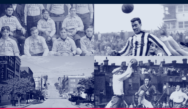
On Thursday, August 13th,2020, it was announced that a new MLS expansion franchise based in St. Louis, Missouri unveiled its name, logo, and color of the club side while it also announced its moniker to be St. Louis City SC. The name was said to be inspired by the history of football in St. Louis when the region produced players representing the country at the World cup in 1950, such as Tim Ream, Josh Sargent, and Becky Sauerbrunn.
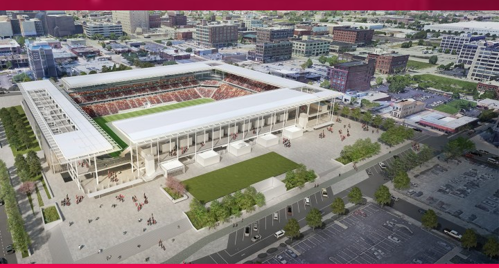
The unveiling was done virtually due to the current state of the country forced by the coronavirus pandemic; it was announced that the team would make its debut in the MLS in 2023.
Carolyn Kindle-Betz In an interview with U.S news outlet, ESPN revealed that over 6,000 submissions from fans were received as over 400 of them contained suggestions of name, logo, and other tips.
“St. Louis City SC is a reflection of the STLMade movement that is at the heart of everything we do, and truly represents our region’s diverse and optimistic spirit,” “Our desire from day one has been to be bigger than soccer and to become part of the fabric of St. Louis and a symbol of our future. This is a significant step forward for our club — and our region.”
Rich history from 1950.
“We’re a brand new soccer team here in St. Louis, brand new stadium, brand new everything,” Kindle-Betz said. “And so we just wanted to make sure that we’re very inclusive of the region, but also embracing our proud heritage.” “It’s a vision that reflects a modern interpretation of our city while paying homage to the icons that everyone recognizes both nationally and internationally,” said owner and chief design architect Lee Broughton.
“The Cardinal red is so iconic, and generations know Cardinal red, so we wanted to make sure that we base our color palette on the St. Louis city flag,” Kindle-Betz said. “We wanted to make sure that our red was unique to St. Louis City SC with a little bit of that pink you can see if you look at it in the right light.”
Broughton added that the logo is also intended to be a celebration of the city’s diversity and neighborhoods.
They’ve been very patient, very supportive and loyal,” she said. “And we want to make sure that we continue to exceed their expectations.


